_
x
Lincoln Prehistoric Museum
Values:
Education
Inclusion
Authenticity
_
x
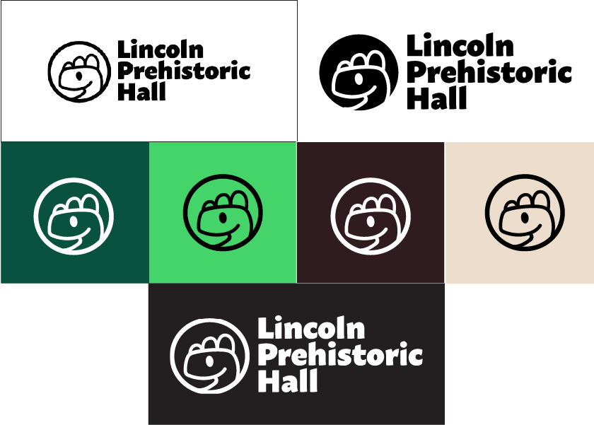
Identity System
When it came to the identity system they wanted to go towards a friendly approach due to the client base being for children. A typography that’s a bit rough but also friendly. There were many iterations at the beginning but client stuck with this design.
The colors were picked as for nature elements.
As mentioned, the typography used was to give off a friendly approach, a text that is easy to read for the logo. Throughout the project I used a lot of typography. To list the typography used is from Adobe Fonts. The list includes, Macho, CCClobberinTimeCrunchy, Early Sans Variable, and Freude.
_
x
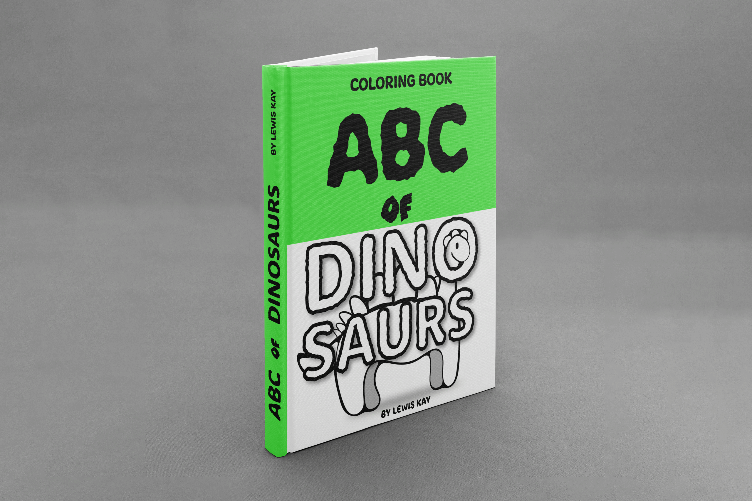
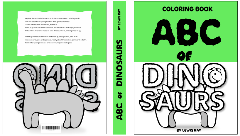
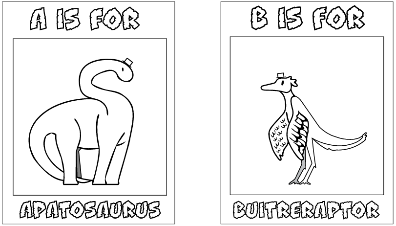
Coloring Book
I started with the mural, I started off with a lot of details, it felt like some of them were not needed. For example, the leaves were part of the original design. Some of the colors seemed like they could bleed or make it harder to see what animals which were. So, I had made a couple of iterations (like color changes, and moving stuff around, removing unnecessary details) before it finally came together, added with text.
_
x
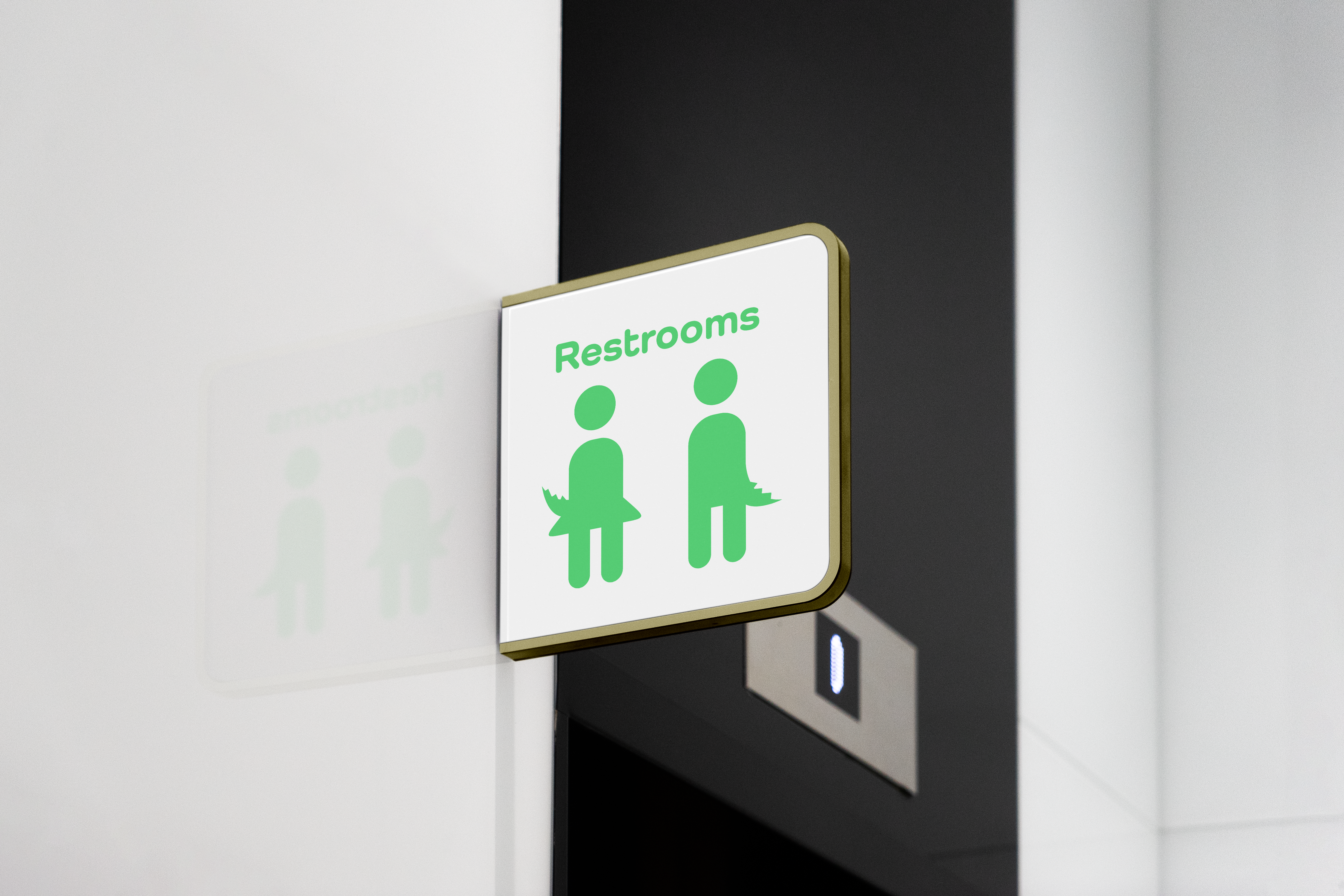
Bathroom Sign
This is the bathroom sign that the client wanted. They wanted it simple that would tell anyone where the bathroom is while having fun with the concept.
_
x
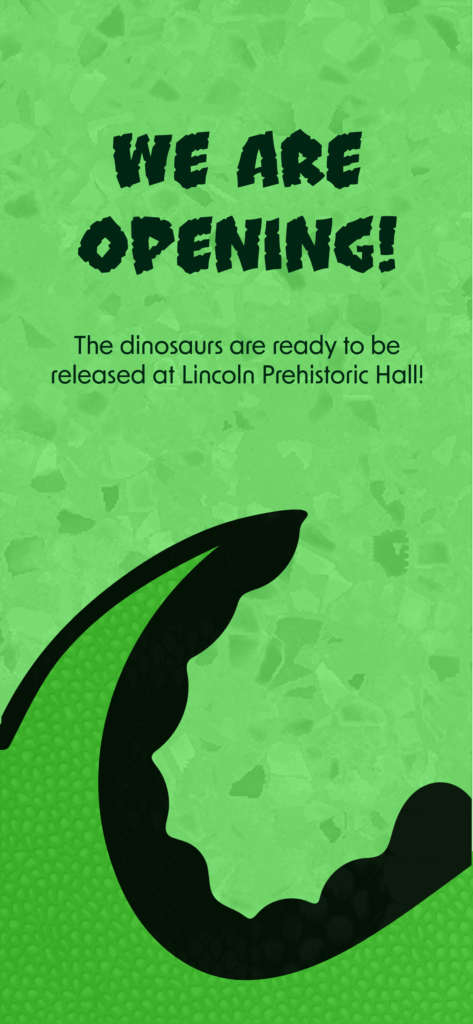
Social Media
The client wanted a social media campaign that makes the viewer want to click through. That is the reason of why the dinosaur is sectioned up, it also was something that appealed to kids.
_
x
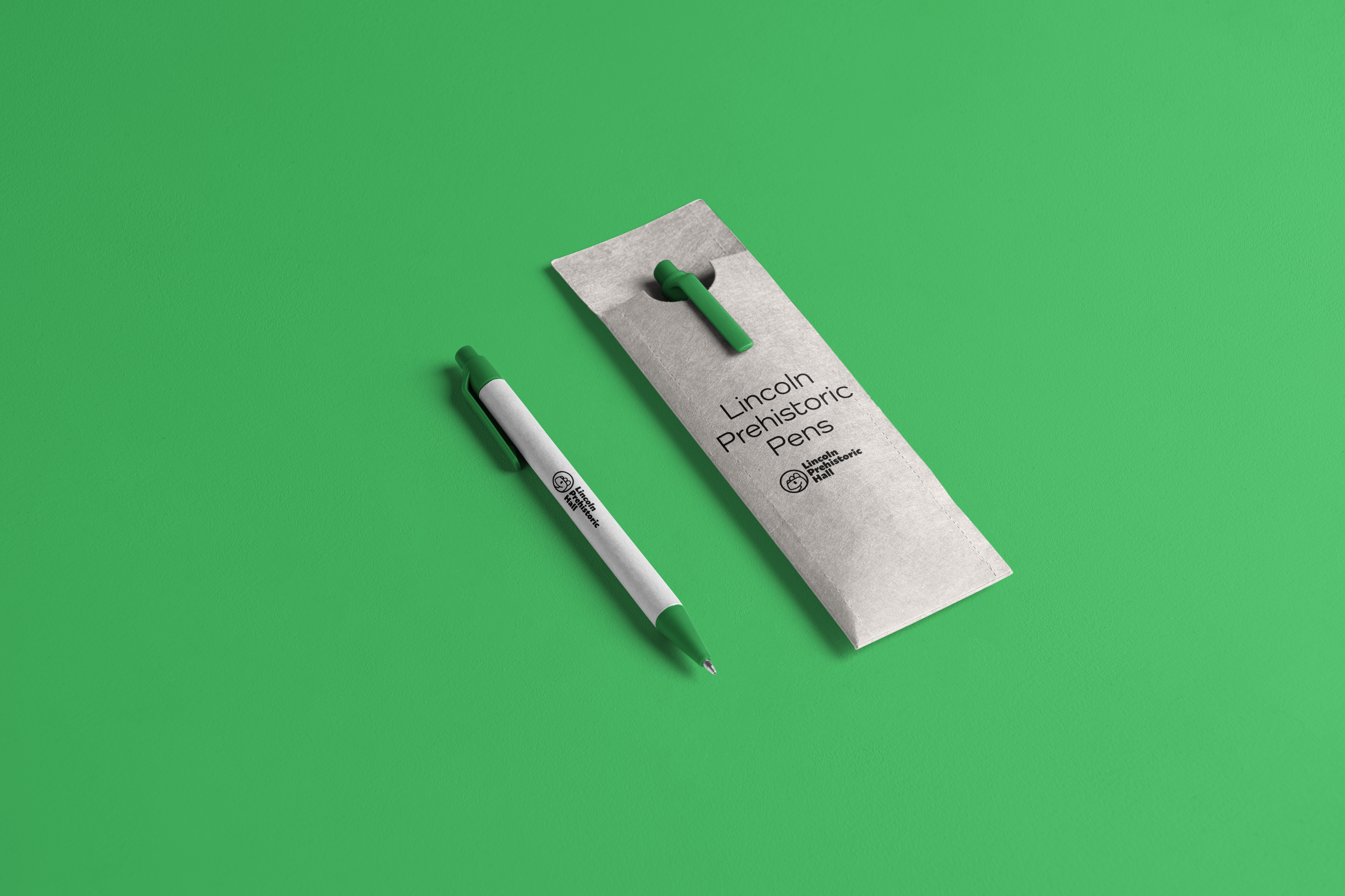
Pen Design
There is one design that the client wanted to support and encourage kids to write more. They were handed out to children and given out to schools to give out for kids to learn and get ready for learning how to write.
_
x
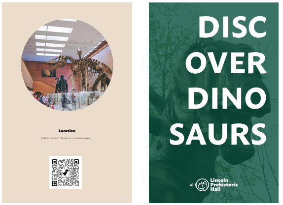
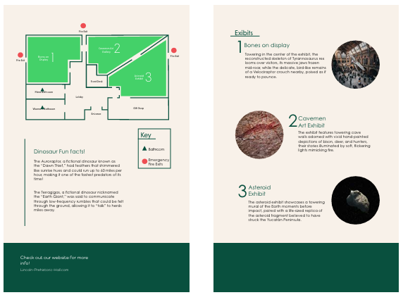
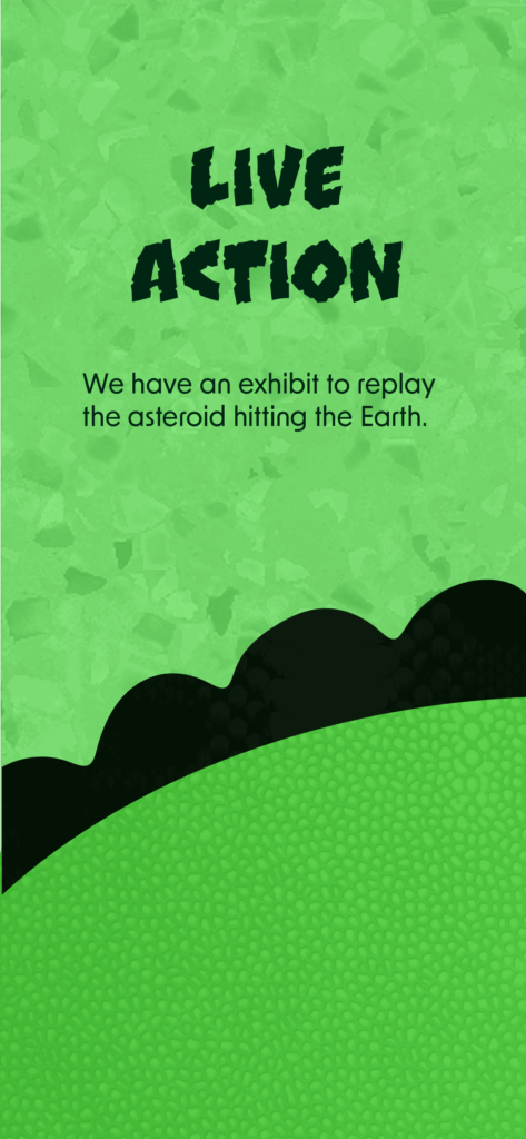
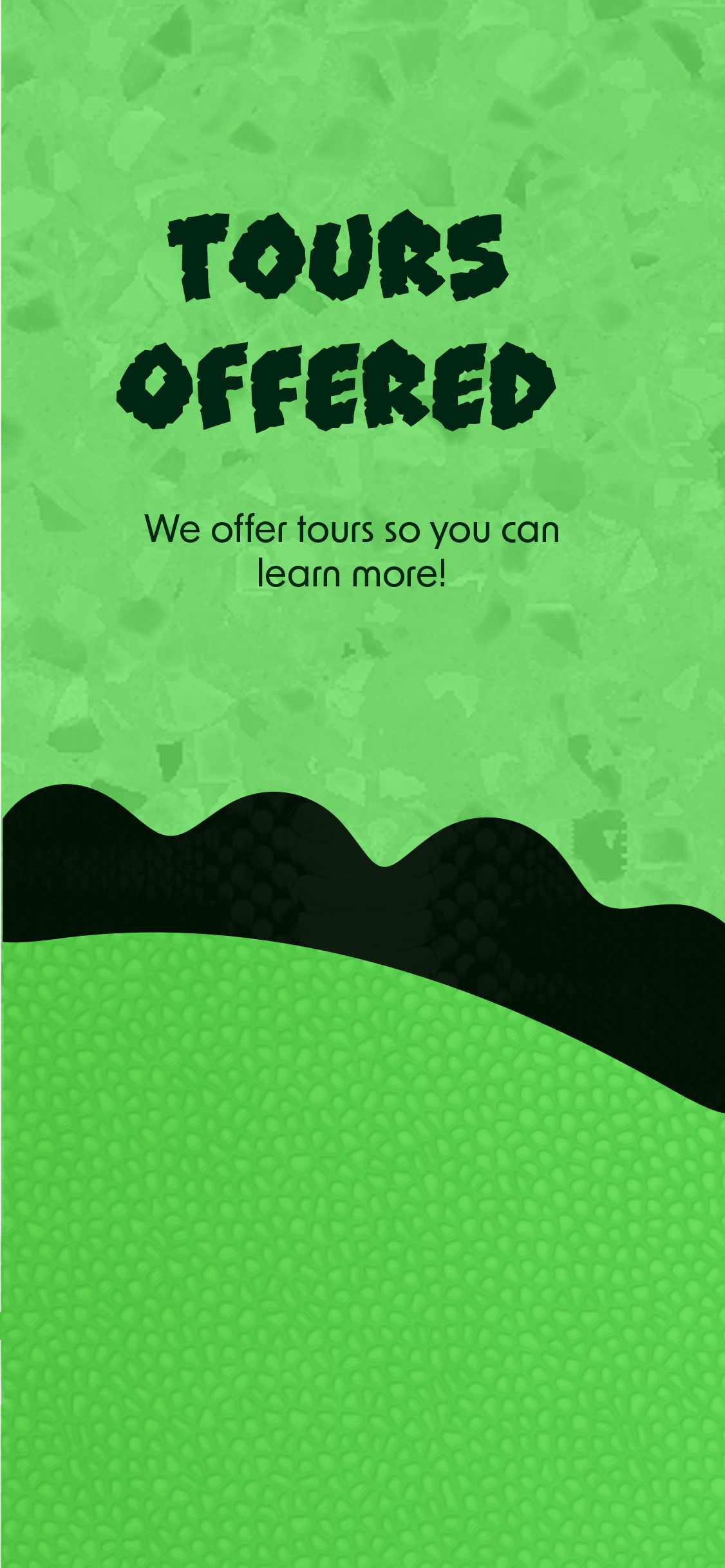
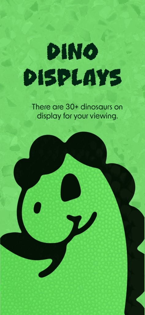
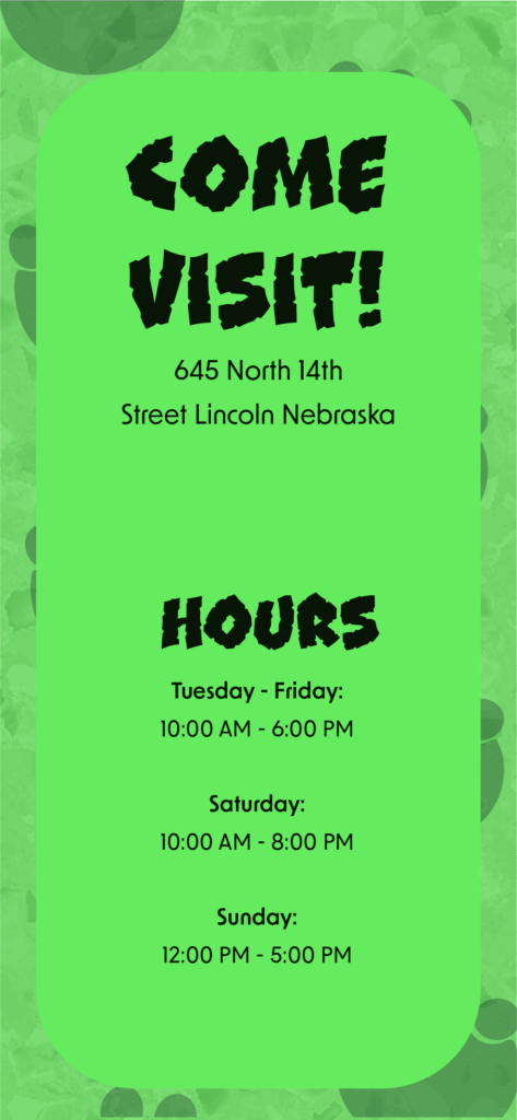
Map / Brochure
This is the brochure you can pick up at the store of the museum. The design was more to highlight the interior of where you can find and locate the different attractions.